Boosting Communication
Between Donors & Charities
Boosting Communication
Between Donors & Charities
Boosting Communication
Between Donors & Charities
A research-driven redesign of Ren's Donor First platform
A research-driven redesign of Ren's Donor First platform
A research-driven redesign of Ren's Donor First platform
87.5
87.5
SUS Score
SUS Score
SUS Score
Excellent
Excellent
Excellent

Overview
Introduction
Introduction
Introduction
Ren Inc. is a philanthropic technology platform that manages donor-advised funds, connecting donors and charities at scale. This project focuses on redesigning Ren’s Donor First experience to improve post-donation engagement and visibility within the ecosystem.
Ren Inc. is a philanthropic technology platform that manages donor-advised funds, connecting donors and charities at scale. This project focuses on redesigning Ren’s Donor First experience to improve post-donation engagement and visibility within the ecosystem.
Tools Used
Tools Used
Tools Used


Project Timeline
Project Timeline
Project Timeline
2 Semesters
2 Semesters
Jan 2025 - Dec 2025
Jan 25' - Dec 25'
My Role
My Role
My Role
UI/ UX Designer &
Researcher
UI/ UX Designer &
Researcher
Project Type
Project Type
Project Type
Capstone
Capstone
Team
Team
Team
Team of 4
Team of 4
Problem
Problem
Problem
Donors had no visibility into how their contributions were used, while charities lacked effective ways to communicate impact, especially across anonymous or intermediary-driven donations. This created a broken feedback loop where giving felt transactional instead of meaningful.
Donors had no visibility into how their contributions were used, while charities lacked effective ways to communicate impact, especially across anonymous or intermediary-driven donations. This created a broken feedback loop where giving felt transactional instead of meaningful.
Goal
Goal
Goal
To design a system that reconnects donors and charities by enabling clear, privacy-preserving visibility into impact. The solution needed to support transparency, donor control, and simple communication within a complex financial ecosystem.
To design a system that reconnects donors and charities by enabling clear, privacy-preserving visibility into impact. The solution needed to support transparency, donor control, and simple communication within a complex financial ecosystem.
Contributions
What did I do?
What did I do?
What did I do?
Our Capstone with Ren Inc., a team of 4. My throughline was synthesis and connection, working across and in research and design.
Our Capstone with Ren Inc., a team of 4. My throughline was synthesis and connection, working across and in research and design.
Co-conducted user interviews with financial advisors and charity representatives.
Co-conducted user interviews with financial advisors and charity representatives.
Organized raw notes into structured affinity maps in FigJam, turning observations into themes.
Organized raw notes into structured affinity maps in FigJam, turning observations into themes.
Contributed to heuristic evaluations of both Donor First and Ren for Charities.
Contributed to heuristic evaluations of both Donor First and Ren for Charities.
Co-led visual design and prototyping; co-produced the final poster and brochure.
Co-led visual design and prototyping; co-produced the final poster and brochure.
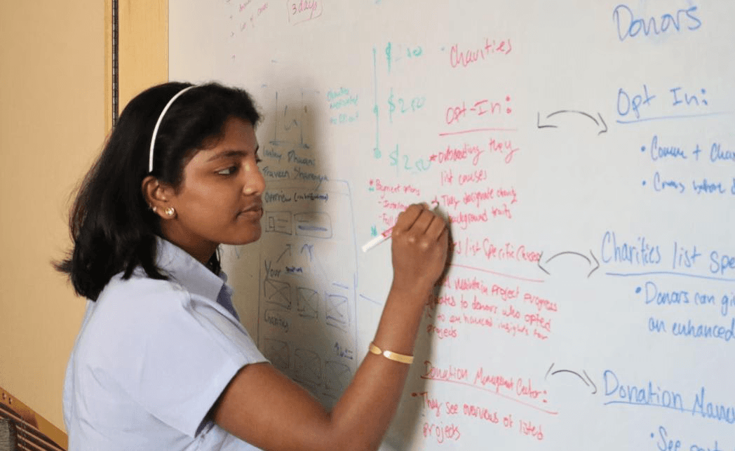
Quick Heads-up ⚠️
Quick Heads-up ⚠️
Quick Heads-up ⚠️
This is a research- and design-heavy case study, and it runs long because the project did. Each phase earned its space in the story, and I didn't want to cut what shaped the final design.
Use the table of contents to navigate by what interests you most. Read straight through, or jump to the parts that pull you in. There's no wrong way to read this!
This is a research- and design-heavy case study, and it runs long because the project did. Each phase earned its space in the story, and I didn't want to cut what shaped the final design.
Use the table of contents to navigate by what interests you most. Read straight through, or jump to the parts that pull you in. There's no wrong way to read this!
This is a research- and design-heavy case study, and it runs long because the project did. Each phase earned its space in the story, and I didn't want to cut what shaped the final design.
Use the table of contents to navigate by what interests you most. Read straight through, or jump to the parts that pull you in. There's no wrong way to read this!
About Ren
Ren Inc. powers the infrastructure of charitable giving
Ren Inc. powers the infrastructure of charitable giving
Ren Inc. powers the infrastructure of charitable giving
Ren Inc. enables large-scale philanthropic giving across financial institutions and nonprofits in North America. At its core, it supports donor-advised funds (DAFs), allowing donors to contribute, grow, and distribute charitable assets over time through financial institutions.
The experience is powered through two connected but separate platforms:
Ren Inc. enables large-scale philanthropic giving across financial institutions and nonprofits in North America. At its core, it supports donor-advised funds (DAFs), allowing donors to contribute, grow, and distribute charitable assets over time through financial institutions.
The experience is powered through two connected but separate platforms:
Donor First (DFX)
Donor First (DFX)
Where donors manage funds and make grants
Where donors manage funds and make grants
Ren for Charities (RFC)
Ren for Charities (RFC)
Where nonprofits receive and respond to donations
Where nonprofits receive and respond to donations
Together, they form a full giving ecosystem, from donor intent to fund distribution. However, these systems currently operate independently, without a connected view of impact after a donation is made.
Together, they form a full giving ecosystem, from donor intent to fund distribution. However, these systems currently operate independently, without a connected view of impact after a donation is made.
The Problem
Why did giving feel incomplete?
Why did giving feel incomplete?
Why did giving feel incomplete?
Donor-advised funds are built on generosity today for impact tomorrow. But for donors and charities, the experience often stopped at the transaction, leaving a gap in the giving journey.
Donor-advised funds are built on generosity today for impact tomorrow. But for donors and charities, the experience often stopped at the transaction, leaving a gap in the giving journey.
Pain Points
Pain Points
Pain Points
Donor Pain
Donor Pain
No visibility into impact. Once a grant was made, donors rarely heard back. Many wanted to know their money mattered- but not a flood of solicitations.
No visibility into impact. Once a grant was made, donors rarely heard back. Many wanted to know their money mattered- but not a flood of solicitations.
Giving felt one-directional
Giving felt one-directional
Hard to track or remember
what they supported
Hard to track or remember
what they supported
Hard to track or remember what they supported
Emotional disconnect after
the moment of giving
Emotional disconnect after
the moment of giving
Emotional disconnect after
the moment of giving
Charity Pain
Charity Pain
Limited ways to say thank you or share impact.
Especially for small nonprofits, anonymous grants and limited tools made stewardship difficult.
Limited ways to say thank you or share impact.
Especially for small nonprofits, anonymous grants and limited tools made stewardship difficult.
Limited ways to say thank you or share impact.
Especially for small nonprofits, anonymous grants and limited tools made stewardship difficult.
Couldn't easily thank donors
Couldn't easily thank donors
Hard to share impact without donor contact info
Hard to share impact without donor contact info
Hard to share impact without donor contact info
Manual processes added operational burden
Manual processes added operational burden
Manual processes added operational burden
The pain wasn't in the platforms. It was between them!
The pain wasn't in the platforms. It was between them!
The pain wasn't in the platforms. It was between them!
Mapping the donor and charity journeys side by side reveals where the experience breaks down.
Mapping the donor and charity journeys side by side reveals where the experience breaks down.

Approach
How did we tackle it?
How did we tackle it?
How did we tackle it?
We approached the problem in four phases - moving from listening, to learning, to designing, to validating.
We approached the problem in four phases - moving from listening, to learning, to designing, to validating.

Throughout all four phases, we held two perspectives at once - the donor and the charity.
Every research question, design decision, and test was viewed through both lenses. The goal was always the same: close the loop between them.
Throughout all four phases, we held two perspectives at once - the donor and the charity.
Every research question, design decision, and test was viewed through both lenses. The goal was always the same: close the loop between them.
Donor Perspective
Donor
Perspective
We started by understanding the donor experience
We started by
understanding the
donor experience
The Connection
Then design the link that closes the loop
Charity Perspective
Charity
Perspective
Ensure the solution delivers real impact for Charities
Ensure the
solution delivers real impact for Charities
Research
Listening to both sides
Listening to both sides
Listening to both sides
Our team conducted thorough primary and secondary research - combining stakeholder conversations, user interviews, competitive benchmarking, and literature review to ensure we deeply understood the problem space before designing anything.
Overall Research Insights:
Our team conducted thorough primary and secondary research - combining stakeholder conversations, user interviews, competitive benchmarking, and literature review to ensure we deeply understood the problem space before designing anything.
Overall Research Insights:

Behind these numbers was a deliberate process. We worked through three layers of research - Secondary, Primary, and synthesis, each one bringing us closer to understanding the real problem.
Behind these numbers was a deliberate process. We worked through three layers of research - Secondary, Primary, and synthesis, each one bringing us closer to understanding the real problem.
Secondary Research
Secondary Research
Secondary Research
We analyzed 9 platforms across three categories to map the landscape and find where the donor–charity gap remained unsolved.
We looked beyond Ren's direct competitors, studying everything from established giving platforms to experimental Web3 models, to understand how others were (or weren't) connecting donors with impact.
What we found: Even the most established platforms gave donors no way to see their impact, or charities a way to respond. The same blind spot, everywhere. That was the opportunity.
We analyzed 9 platforms across three categories to map the landscape and find where the donor–charity gap remained unsolved.
We looked beyond Ren's direct competitors, studying everything from established giving platforms to experimental Web3 models, to understand how others were (or weren't) connecting donors with impact.
What we found: Even the most established platforms gave donors no way to see their impact, or charities a way to respond. The same blind spot, everywhere. That was the opportunity.


01
01
01
02
02
02
We reviewed academic research on donor-advised funds and philanthropic giving to ground our work in established knowledge.
This helped us understand how DAFs function, who uses them and why, and the documented tensions in the space, particularly around donor motivation, anonymity, and the growing distance between giving and impact.
What we found: The literature reinforced a key insight - donors are increasingly motivated by demonstrated impact, yet the systems built to facilitate giving rarely close that loop.
We reviewed academic research on donor-advised funds and philanthropic giving to ground our work in established knowledge.
This helped us understand how DAFs function, who uses them and why, and the documented tensions in the space, particularly around donor motivation, anonymity, and the growing distance between giving and impact.
What we found: The literature reinforced a key insight - donors are increasingly motivated by demonstrated impact, yet the systems built to facilitate giving rarely close that loop.
We conducted Heuristic Evaluations of both of Ren's platforms - Donor First (DFX) and Ren for Charities - following platform walkthroughs with the Ren team.
Using established usability principles, we audited each platform to surface existing friction points, inconsistencies, and gaps in the current experience.
What we found: Both platforms functioned well independently, but neither was built to communicate with the other. The disconnect wasn't a bug - it was structural.
We conducted Heuristic Evaluations of both of Ren's platforms - Donor First (DFX) and Ren for Charities - following platform walkthroughs with the Ren team.
Using established usability principles, we audited each platform to surface existing friction points, inconsistencies, and gaps in the current experience.
What we found: Both platforms functioned well independently, but neither was built to communicate with the other. The disconnect wasn't a bug - it was structural.
03
03
03
Secondary Research Gallery
Secondary Research Gallery
Mapping the Landscape
A look at our competitive analysis and platform evaluations. Scroll to view.


Primary Research
Primary Research
Primary Research
We spoke with stakeholders at Ren to understand the business reality behind the project.
These conversations helped us define what success looked like, understand platform constraints and priorities, and align our research direction with Ren's vision before we ever spoke to users.
What we learned: Ren saw the donor–charity disconnect clearly, but needed a solution that worked within their existing two-platform model - and could scale as fintech competition grew.
We spoke with Ren stakeholders to ground our understanding in the business context.
These conversations helped define success, clarify platform constraints, and align research direction with Ren’s vision.
What we learned: Ren recognized the donor–charity disconnect, but needed a solution that fit their existing two-platform system and could scale with growing fintech competition.
We spoke with stakeholders at Ren to understand the business reality behind the project.
These conversations helped us define what success looked like, understand platform constraints and priorities, and align our research direction with Ren's vision before we ever spoke to users.
What we learned: Ren saw the donor–charity disconnect clearly, but needed a solution that worked within their existing two-platform model - and could scale as fintech competition grew.



01
01
01
02
02
02
We interviewed 6 financial advisors who manage DAF accounts on behalf of donors, and 6 charity representatives who receive DAF grants, hearing directly from both sides of the giving relationship.
From advisors & donors: Many wanted to feel connected to their giving and see its impact, but valued their privacy and didn't want a flood of solicitations.
From charities: Especially smaller ones, they wanted to thank donors and share results, but anonymous gifts and limited tools made stewardship nearly impossible.
What we learned: Both sides wanted connection. The system gave them silence.
We interviewed 6 financial advisors managing DAF accounts and 6 charity representatives receiving grants.
Advisors and donors wanted visibility into impact while maintaining privacy and avoiding solicitation overload.
Charities, especially smaller ones, wanted to acknowledge donors and share outcomes but lacked tools to do so.
What we learned: both sides wanted connection, the system left them in silence.
We interviewed 6 financial advisors who manage DAF accounts on behalf of donors, and 6 charity representatives who receive DAF grants, hearing directly from both sides of the giving relationship.
From advisors & donors: Many wanted to feel connected to their giving and see its impact, but valued their privacy and didn't want a flood of solicitations.
From charities: Especially smaller ones, they wanted to thank donors and share results, but anonymous gifts and limited tools made stewardship nearly impossible.
What we learned: Both sides wanted connection. The system gave them silence.
Insights & Findings
From Conversations to Clarity!
From Conversations to Clarity!
From Conversations to Clarity!
With research complete, the real work began: making sense of it. Through affinity mapping, we organized 21 interviews and secondary research into clear patterns, surfacing the themes that would shape every design decision.
This is where I focused most - bringing our raw interview notes into readable, organized insights in FigJam, and contributing heavily to the themes we built from them.
With research complete, the real work began: making sense of it. Through affinity mapping, we organized 21 interviews and secondary research into clear patterns, surfacing the themes that would shape every design decision.
This is where I focused most - bringing our raw interview notes into readable, organized insights in FigJam, and contributing heavily to the themes we built from them.
Figjam Gallery
Figjam Gallery
Figjam Gallery
Inside the Synthesis
Inside the Synthesis
Affinity mapping - clustering raw observations into patterns starting with FA
Affinity mapping - clustering raw observations into patterns starting with FA

Synthesizing Donor & Financial Advisor Interviews
Synthesizing Donor & Financial Advisor Interviews
Synthesizing Donor & Financial Advisor Interviews

Synthesizing Charity Interviews
Synthesizing Charity Interviews
Synthesizing Charity Interviews
Behind the Clusters
Behind the Clusters
Before grouping anything, a handful of concrete findings stood out across our interviews and platform analysis. These are the following Research Findings:
Donors often couldn't recall what happened after they gave; many said they never received confirmation that their donation was even received.
Several donors said they would give more or more often if they could actually see the outcomes of past contributions.
Charities - especially smaller ones, said anonymous gifts left them with no way to reach or thank the donor.
Financial advisors managed giving on behalf of donors, which added another layer of distance between the donor and the charity.
Across the 9 platforms we analyzed, almost none offered post-donation updates or any donor–charity communication.
Our heuristic evaluation found that Donor First and Ren for Charities were built as separate systems, with no shared view of a donation's journey.
Research Themes
Research Themes
Research Themes
Once the notes were clustered and the noise cleared, patterns started to take shape. Five themes rose to the surface - each one a thread connecting what donors/advisors, and charities were really asking for.

Five themes gave us clarity on what was broken. But we couldn't solve everything for everyone at once. To design something real and feasible within Ren's existing platforms, we first had to narrow our focus.
Five themes gave us clarity on what was broken. But we couldn't solve everything for everyone at once. To design something real and feasible within Ren's existing platforms, we first had to narrow our focus.
Solution
Building the Bridge!
Building the Bridge!
Building the Bridge!
The research had given us a question. The next chapter had to give us an answer.
We turned from listening to making, but making began long before the first screen. We sketched broadly, deliberately narrowed our scope, and, somewhere in the middle, a story from a shrine in Japan reshaped how we saw the entire problem.
The research had given us a question. The next chapter had to give us an answer.
We turned from listening to making, but making began long before the first screen. We sketched broadly, deliberately narrowed our scope, and, somewhere in the middle, a story from a shrine in Japan reshaped how we saw the entire problem.
Ideation
Ideation
Ideation
We started broad. Using the Crazy 8 method, each team member sketched 8 quick concepts in 8 minutes - forcing speed over polish.
We then shared, clustered, and pressure-tested every idea against the five themes from our research: Communication, Impact, Privacy, Stewardship, Simplicity.
Most ideas didn't survive. But the survivors pointed toward one direction - a system that let donors witness their impact without losing their privacy.
We started broad. Using the Crazy 8 method, each team member sketched 8 quick concepts in 8 minutes - forcing speed over polish.
We then shared, clustered, and pressure-tested every idea against the five themes from our research: Communication, Impact, Privacy, Stewardship, Simplicity.
Most ideas didn't survive. But the survivors pointed toward one direction - a system that let donors witness their impact without losing their privacy.
1
1
1
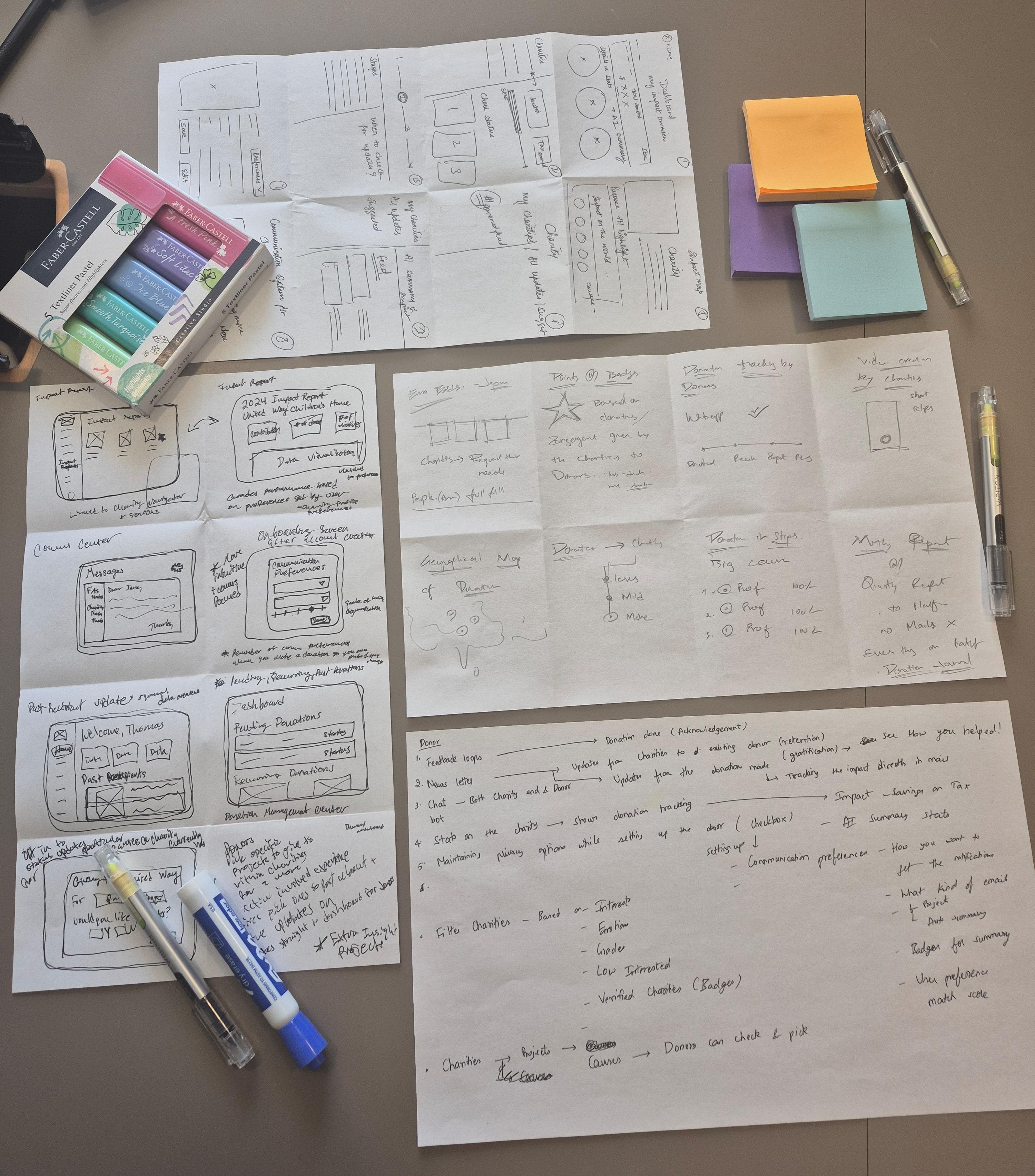
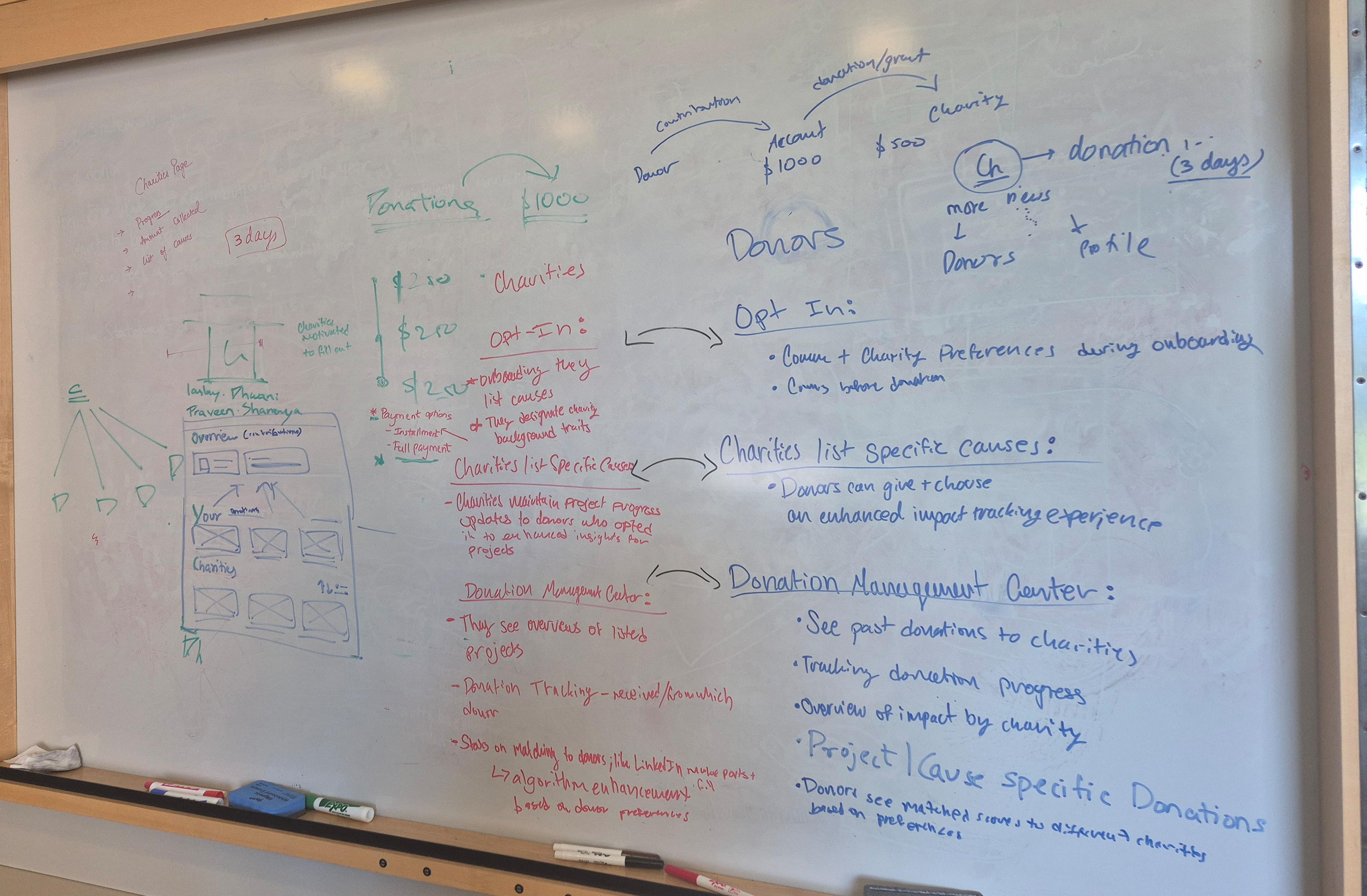
Crazy 8 and Brainstorming Glimpses
Crazy 8
Crazy 8
A rapid sketching method where each designer produces 8 distinct concepts in 8 minutes, prioritizing volume over polish!
A rapid sketching method where each designer produces 8 distinct concepts in 8 minutes, prioritizing volume over polish!
A rapid sketching method where each designer produces 8 distinct concepts in 8 minutes, prioritizing volume over polish!
Affinity Mapping
Affinity Mapping
Affinity Mapping
Clustering the Concepts
Clustering the Concepts
We mapped every concept onto a board and clustered them by theme, turning a wall of ideas into a handful of clear directions.
We mapped every concept onto a board and clustered them by theme, turning a wall of ideas into a handful of clear directions.

Narrowing the Scope
Narrowing the Scope
Narrowing the Scope
Clustering our ideas surfaced clear patterns, but it also surfaced a harder question: Which problem were we actually solving?
The disconnect between donors and charities had many faces. Before we could design a solution, we had to decide which face we were designing for.
Clustering our ideas surfaced clear patterns, but it also surfaced a harder question: Which problem were we actually solving?
The disconnect between donors and charities had many faces. Before we could design a solution, we had to decide which face we were designing for.
2
2
2
Problem Statements
Problem Statements
Problem Statements
As a team, we wrote five problem statements - each framing the challenge from 3 different angles:
1. Two Statements for Communication - Charities & Donors
2. Two for Searching for Charities & Elevating Charities to Donors
3. For better Data Visualization.
Each captured a real piece of the disconnect. We pressure-tested each one against our research themes, our scope, and the user voices that came up most often in interviews. One statement kept rising to the top.
Below are the Problem Statements:
As a team, we wrote five problem statements - each framing the challenge from 3 different angles:
1. Two Statements for Communication - Charities & Donors
2. Two for Searching for Charities & Elevating Charities to Donors
3. For better Data Visualization.
Each captured a real piece of the disconnect. We pressure-tested each one against our research themes, our scope, and the user voices that came up most often in interviews. One statement kept rising to the top.


We chose the first one: a donor-focused statement. It traced back to the most repeated theme across our 21 interviews: donors wanted to stay connected to their giving, but the system offered them no path that respected both their interest and their privacy.
"As a donor, when I've made my charitable contributions for the year, I want to keep up with the donations I gave to charities, maintaining a connection, so I can feel a greater sense of involvement from the impact my dollar has made, but the current process offers little control or access to track if my donation was received, let alone creating a connection with my chosen charities, resulting in frustration from the all-or-nothing approach to communication."
"As a donor, when I've made my charitable contributions for the year, I want to keep up with the donations I gave to charities, maintaining a connection, so I can feel a greater sense of involvement from the impact my dollar has made, but the current process offers little control or access to track if my donation was received, let alone creating a connection with my chosen charities, resulting in frustration from the all-or-nothing approach to communication."
"As a donor, when I've made my charitable contributions for the year, I want to keep up with the donations I gave to charities, maintaining a connection, so I can feel a greater sense of involvement from the impact my dollar has made, but the current process offers little control or access to track if my donation was received, let alone creating a connection with my chosen charities, resulting in frustration from the all-or-nothing approach to communication."
And with that, the question that would guide every design decision took shape.
And with that, the question that would guide every design decision took shape.
How might we..
How might we..
How might we..
empower donors to easily track and understand the impact of their contributions, while preserving their control and choice in how they communicate with charities?
empower donors to easily track and understand the impact of their contributions, while preserving their control and choice in how they communicate with charities?
Know the Ema Tradition
Know the Ema Tradition
Midway through ideation, Praveen Surathu brought in a story - Ema.
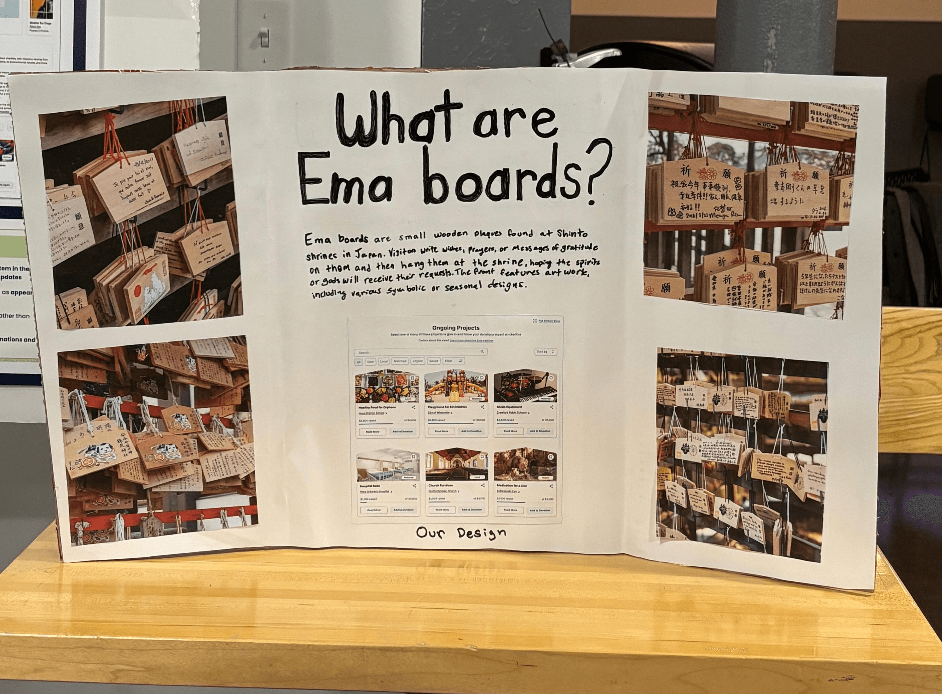
In Japan, ema (絵馬) are small wooden plaques hung at Shinto shrines. Each one carries a wish - for healing, for success, for hope. Once hung, the wish belongs to the shrine: visible, open, waiting to be received.
Our team reimagined the idea. What if charities could hang their projects the way one hangs an ema - open, visible, but never asking? And what if donors could pluck the wishes they felt called to fulfill - choosing, not being chosen by?
That reframe changed everything. We weren't designing dashboards for donors anymore. We were designing a way for a real charity's need to reach the person who could fulfill it, without solicitation, without pressure, without losing privacy.
3
3

Features
Designing the Bridge!
Designing the Bridge!
Designing the Bridge!
Five features. One connected experience - each designed to honor the quiet exchange between donor and charity. We built within Ren's existing MUI Toolkit, ensuring visual consistency with their platforms while reimagining the experience.
Five features. One connected experience - each designed to honor the quiet exchange between donor and charity. We built within Ren's existing MUI Toolkit, ensuring visual consistency with their platforms while reimagining the experience.
Dashboard / Ongoing Projects
Dashboard / Ongoing Projects
Dashboard / Ongoing Projects
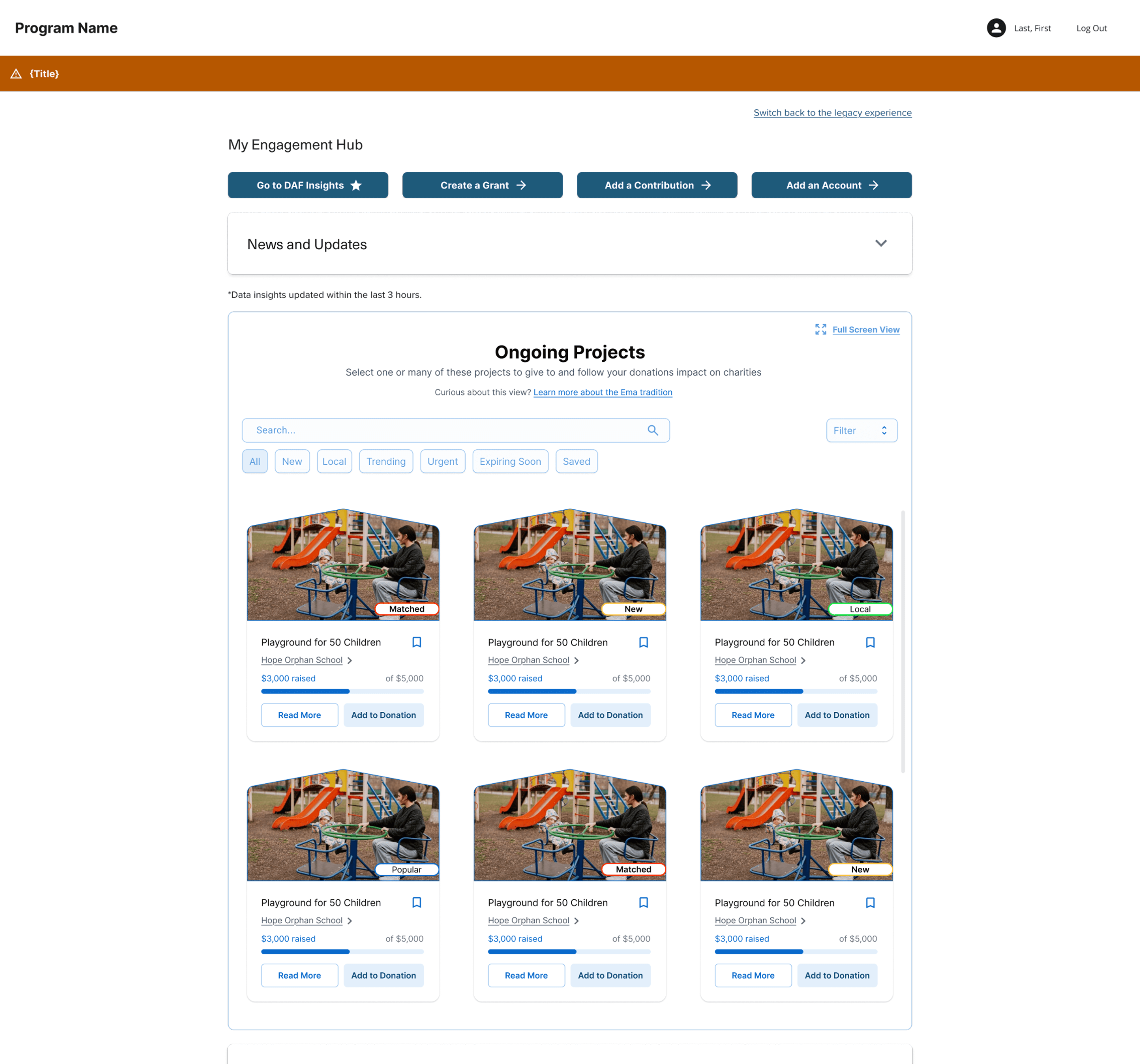
The donor's home base. A scannable view of the projects they support, with filters to discover new causes - Local, Matched, Urgent. It turns giving from a one-time transaction into an ongoing, trackable relationship with specific projects, not abstract organizations.
Below are the iterations from Low-Fi to High Fidelity, with the iterations explained.
The donor's home base. A scannable view of the projects they support, with filters to discover new causes - Local, Matched, Urgent. It turns giving from a one-time transaction into an ongoing, trackable relationship with specific projects, not abstract organizations.
Below are the iterations from Low-Fi to High Fidelity, with the iterations explained.
1
1
1


Iterations
Iterations

Multiple Donation Process
Multiple Donation Process
Multiple Donation Process
The Multiple Donation Process lets donors fund multiple charities or projects in a single, streamlined flow - setting their preferences for communication, anonymity, and follow-up as they go. It turns batch giving from a chore into a deliberate act, where each gift carries its own choices.
Below are the iterations from Low-Fi to High Fidelity, with the iterations explained.
The Multiple Donation Process lets donors fund multiple charities or projects in a single, streamlined flow - setting their preferences for communication, anonymity, and follow-up as they go. It turns batch giving from a chore into a deliberate act, where each gift carries its own choices.
Below are the iterations from Low-Fi to High Fidelity, with the iterations explained.
2
2
2


Iterations
Iterations

Donor Journal
Donor Journal
Donor Journal
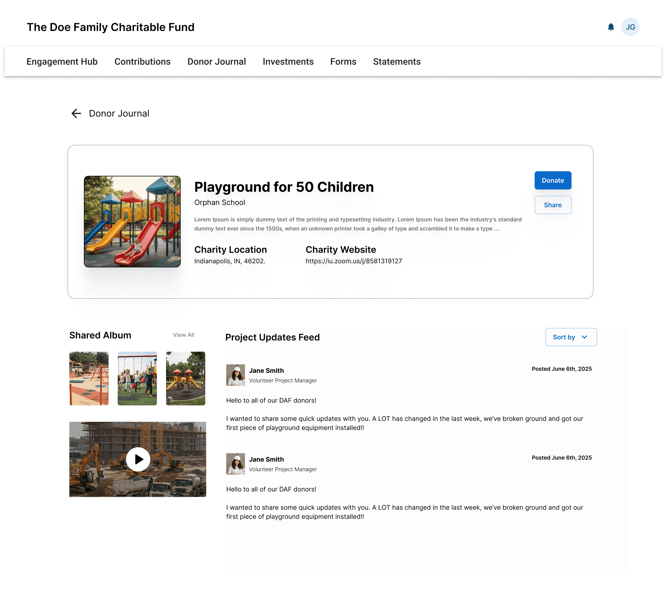
A private, donor-only feed of updates from the projects they've funded, photos, progress, milestones, and shared albums from each charity. The journal lets giving live on as memory, not just transaction.
The Donor Journal also includes Achievements - a sidecar gamification layer with milestone badges, designed to feel like recognition rather than competition.
Below are the iterations of Donor Journal Screens from Low-Fi to High Fidelity, with the iterations explained.
A private, donor-only feed of updates from the projects they've funded, photos, progress, milestones, and shared albums from each charity. The journal lets giving live on as memory, not just transaction.
The Donor Journal also includes Achievements - a sidecar gamification layer with milestone badges, designed to feel like recognition rather than competition.
Below are the iterations of Donor Journal Screens from Low-Fi to High Fidelity, with the iterations explained.
3
3
3


Iterations
Iterations

Impact Profile
Impact Profile
Impact Profile
The Impact Profile is where donors see the real-world results of a charity's work - projects in progress, outcomes, and stories from the field. It's stewardship made visible: charities showing what their work achieves, without needing to chase or solicit.
Below are the iterations from Low-Fi to High Fidelity, with the iterations explained.
The Impact Profile is where donors see the real-world results of a charity's work - projects in progress, outcomes, and stories from the field. It's stewardship made visible: charities showing what their work achieves, without needing to chase or solicit.
Below are the iterations from Low-Fi to High Fidelity, with the iterations explained.
4
4
4



Iterations
Iterations

Testing
Putting the Bridge to Test!
Putting the Bridge to Test!
Putting the Bridge to Test!
Before submitting to Ren, we put the bridge through real use, testing whether the design held up under intent. We wanted to know: Did it feel like the connection we'd designed, or just a screen people clicked through?
Before submitting to Ren, we put the bridge through real use, testing whether the design held up under intent. We wanted to know: Did it feel like the connection we'd designed, or just a screen people clicked through?
How we tested
How we tested
1
1
The Impact Profile is where donors see the real-world results of a charity's work - projects in progress, outcomes, and stories from the field. It's stewardship made visible: charities showing what their work achieves, without needing to chase or solicit.
The Impact Profile is where donors see the real-world results of a charity's work - projects in progress, outcomes, and stories from the field. It's stewardship made visible: charities showing what their work achieves, without needing to chase or solicit.
Method
Task-based think-aloud usability testing + SUS with A/B feedback questions
Participants
3 DAF Donors recruited through Ren's network
Duration
45 minutes
each session (Zoom)
Goals
Test usability, connection, and engagement across the donation experience and impact features
Method
Method
Task-based think-aloud usability testing + SUS with A/B feedback questions
Task-based think-aloud usability testing + SUS with A/B feedback questions
Participants
Participants
3 DAF Donors recruited through Ren's network
3 DAF Donors recruited through Ren's network
Duration
Duration
45 minutes
each session (Zoom)
45 minutes
each session (Zoom)
Goals
Goals
Test usability, connection, and engagement across the donation experience and impact features
Test usability, connection, and engagement across the donation experience and impact features
What we tested
What we tested
What we tested
Clustering the Concepts
Clustering the Concepts
Our testing focused on the moments that define donor engagement: discovering causes, making contributions, and understanding impact. These tasks helped validate whether the experience successfully strengthened the connection between donors and charities.
We designed the interview script around three core tasks that reflect the primary user flow and key features. Participants interacted with the design prototype shared with Ren, allowing us to evaluate usability and identify opportunities for iteration.
Our testing focused on the moments that define donor engagement: discovering causes, making contributions, and understanding impact. These tasks helped validate whether the experience successfully strengthened the connection between donors and charities.
We designed the interview script around three core tasks that reflect the primary user flow and key features. Participants interacted with the design prototype shared with Ren, allowing us to evaluate usability and identify opportunities for iteration.
1
Finding Explore
Searching, filtering, and sorting projects on the Ongoing Projects wall
2
Give
Selecting and making a donation (single or multiple projects)
3
Track Impact
Accessing the Donor Journal and viewing Impact Profiles
To view the Interview Scripts for 3 different user personas, you can click the button below.
To view the Interview Scripts for 3 different user personas, you can click the button below.
View Interview Scripts →
What we found
What we found
What we found
2
2
The testing revealed clear behavioral patterns across usability, clarity, and emotional engagement, highlighting both strong wins and friction points in the experience.
After conducting the interviews, we organized all insights into clear categories:
What users liked
What they didn’t like
What they didn’t notice
Suggested improvements
Each session was then summarized individually to capture the overall participant experience. Below are snapshots from FigJam showcasing the key insights from the interviews.
The testing revealed clear behavioral patterns across usability, clarity, and emotional engagement, highlighting both strong wins and friction points in the experience.
After conducting the interviews, we organized all insights into clear categories:
What users liked
What they didn’t like
What they didn’t notice
Suggested improvements
Each session was then summarized individually to capture the overall participant experience. Below are snapshots from FigJam showcasing the key insights from the interviews.
Figjam Gallery
Figjam Gallery


Participant Feedback
Participant Feedback
VOICES FROM TESTING
Direct participant feedback captured emotional and experiential insights from testing.
The Donor Journal is fantastic. It helps me clearly understand the full impact of my giving.
It makes me feel confident about where my money is going!

John Castles
VOICES FROM TESTING
Direct participant feedback captured emotional and experiential insights from testing.
The Donor Journal is fantastic. It helps me clearly understand the full impact of my giving.
It makes me feel confident about where my money is going!
John Castles
While participants liked the new interaction and the new bridge, there were still a couple of things they were a bit hesitant about. Here's a quick understanding of what worked, what didn't, and what changes were needed, which would be shown in the next section.
Big Wins
Big Wins
The project model resonated. Donating to specific projects, not just charities, felt more intentional and connected.
The Donor Journal landed emotionally. One tester called it "fantastic"; others asked for more, not less.
Impact Profiles created real connection. Testers asked for more social features, a strong sign the format was reaching them.
Frustations
Frustations
Naming confused expectations. "Charity Updates" read as general charity news, testers wanted them tied to their specific past gifts.
Key actions weren't discoverable. Multi-project selection and full-screen view existed, but no tester found them unprompted.
Default view mismatched intent. Testers wanted Analytics first, Summary second, the opposite of what we'd built.
Changes
Changes
Restructured the Donor Journal to reflect project-specific updates by default.
Surfaced hidden actions, made multi-project selection visible and repositioned the full-screen view CTA.
Added context to Impact Profile headers, project progress, timeline, and status, so donors knew where their gift sat in the bigger picture.
Final Design
Crossing the Bridge!
Crossing the Bridge!
Crossing the Bridge!
Testing gave us a clear list of what worked, what didn't, and what needed sharpening. The final version we delivered to Ren carried every meaningful change forward, was built within scope, and was refined by real users.
Testing gave us a clear list of what worked, what didn't, and what needed sharpening. The final version we delivered to Ren carried every meaningful change forward, was built within scope, and was refined by real users.
Dicoverability Fixes
Dicoverability Fixes
Dicoverability Fixes
1
1
Four powerful interactions existed in the design, but testers walked right past them.
Four powerful interactions existed in the design, but testers walked right past them.
Multi-project selection
Hidden in plain sight in the original.
0 of 3 testers tried it without prompting.
Added visible "Add to List" + "Donate Now" CTAs.
Full-screen view
3 of 3 testers wouldn't have clicked the original toggle.
2 of 3 saw value in it (especially for older audiences).
Repositioned the CTA with a clearer visual cue.
Filters as tags
Filters were buried in a dropdown menu.
2 of 3 testers expected them to behave like tag pills.
Pulled out into a scannable row, alongside the existing tags.
Project Updates on the home page
One tester expected updates in the Engagement Hub.
3 of 3 wanted updates tied to their gifts.
Added a Project Updates feed above Ongoing Projects.

Wording Clarifications
Wording Clarifications
Wording Clarifications
2
2
Small word changes that reset expectations.
Small word changes that reset expectations.
Project-Specific Naming
Original wording read as general charity news.
3 of 3 testers expected updates tied to their gifts.
Renamed the section, rephrased cards, surfaced grant IDs.
CTA Reformed
Impact Profiles said "Donate" even for repeat donors.
2 of 3 testers flagged it as feeling impersonal.
New wording acknowledges history with the project.
Analytics view
Donor Journal showed Summary first, Analytics second.
3 of 3 testers wanted Analytics first
Flipped the default view.
For-you section
No way to discover new projects based on giving history.
3 of 3 testers wanted personalized recommendations.
Added a scrollable section, similar projects + aligned charities.


Beyond these, we tightened dozens of quieter details, sticky navigation between pages, larger card tags for legibility, grant IDs woven into update cards so donors could trace each story back to a specific gift, and a "Save for Later" affordance for projects donors weren't ready to fund yet.
The full prototype is linked below - see the bridge in motion.
Beyond these, we tightened dozens of quieter details, sticky navigation between pages, larger card tags for legibility, grant IDs woven into update cards so donors could trace each story back to a specific gift, and a "Save for Later" affordance for projects donors weren't ready to fund yet.
The full prototype is linked below - see the bridge in motion.
View the Prototype →
Outcomes
The Bridge, Built!
The Bridge, Built!
The Bridge, Built!
Beyond the screens we shipped, we measured how the bridge actually performed and what it meant for the people who walked across it.
Beyond the screens we shipped, we measured how the bridge actually performed and what it meant for the people who walked across it.
The SUS Score
The SUS Score
The SUS Score
Measured across three completed testing sessions against the System Usability Scale, the standard industry benchmark.
The System Usability Scale measures how a product feels to use across 10 dimensions, from learnability to consistency. A score of 87.5 places the design firmly in the Excellent band, well above the 68-point industry average that defines a typical product.
Measured across three completed testing sessions against the System Usability Scale, the standard industry benchmark.
The System Usability Scale measures how a product feels to use across 10 dimensions, from learnability to consistency. A score of 87.5 places the design firmly in the Excellent band, well above the 68-point industry average that defines a typical product.

The Deliverables
The Deliverables
The Deliverables

Months of work, packaged for Ren's team to carry forward.
High-Fidelity Figma Prototype - the final interactive donor experience, ready for handoff
Process Documentation (PDF) - 81 pages of weekly design reports, decisions, and testing insights
Poster - the visual anchor for our capstone showcase
Brochure - printed summary of the design and the decisions behind it
FigJam Boards - research synthesis, ideation, and testing analysis
User Testing Protocol - task-based plan + SUS questionnaire
Months of work, packaged for Ren's team to carry forward.
High-Fidelity Figma Prototype - the final interactive donor experience, ready for handoff
Process Documentation (PDF) - 81 pages of weekly design reports, decisions, and testing insights
Poster - the visual anchor for our capstone showcase
Brochure - printed summary of the design and the decisions behind it
FigJam Boards - research synthesis, ideation, and testing analysis
User Testing Protocol - task-based plan + SUS questionnaire
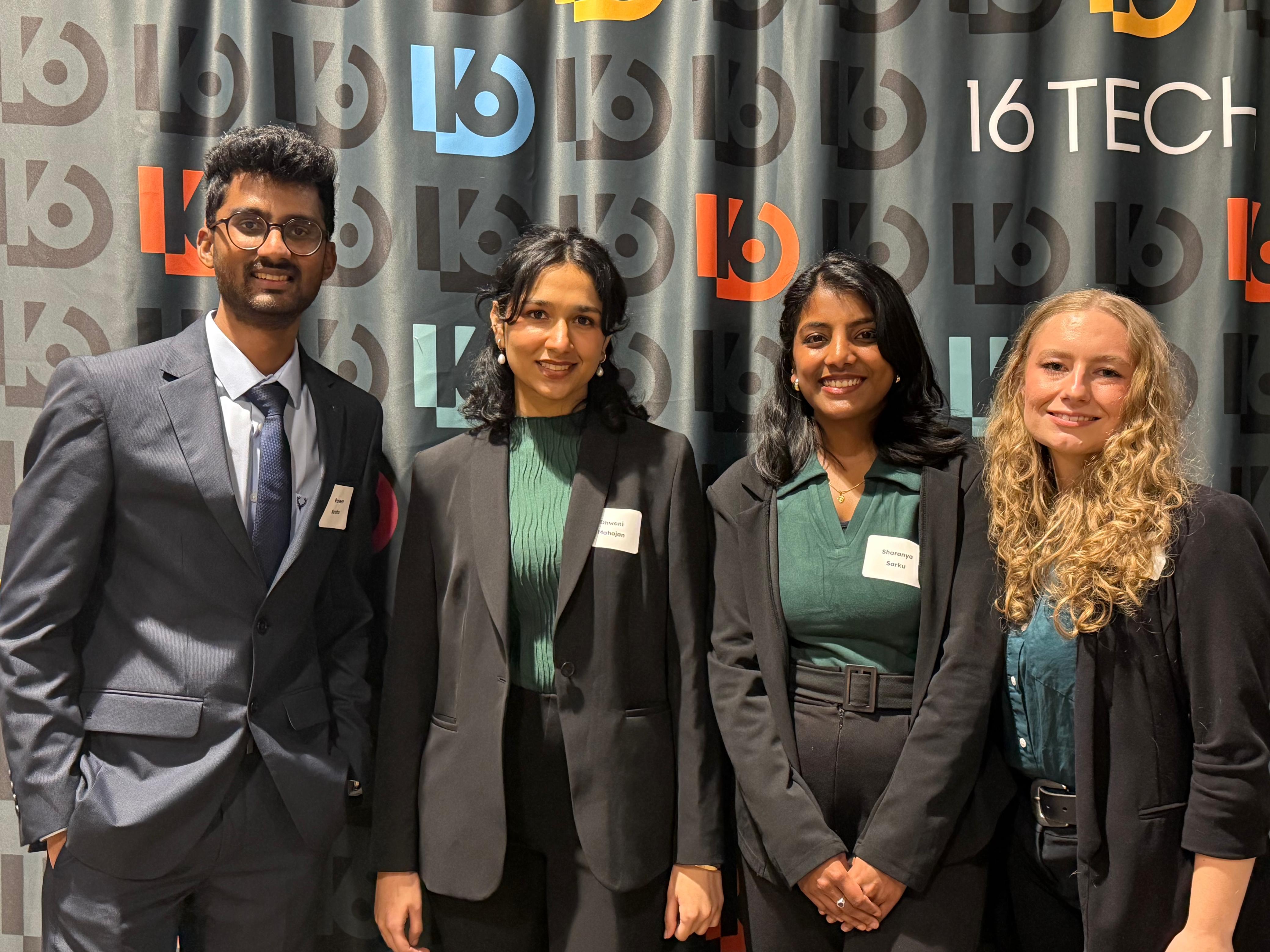
The Capstone Showcase
The Capstone Showcase
The Capstone Showcase
The day:
Two semesters of Research, Ideation, Design, and Testing, culminating in one presentation.
The end of our Master's program, and the end of a project we'd been building since spring.
The team:
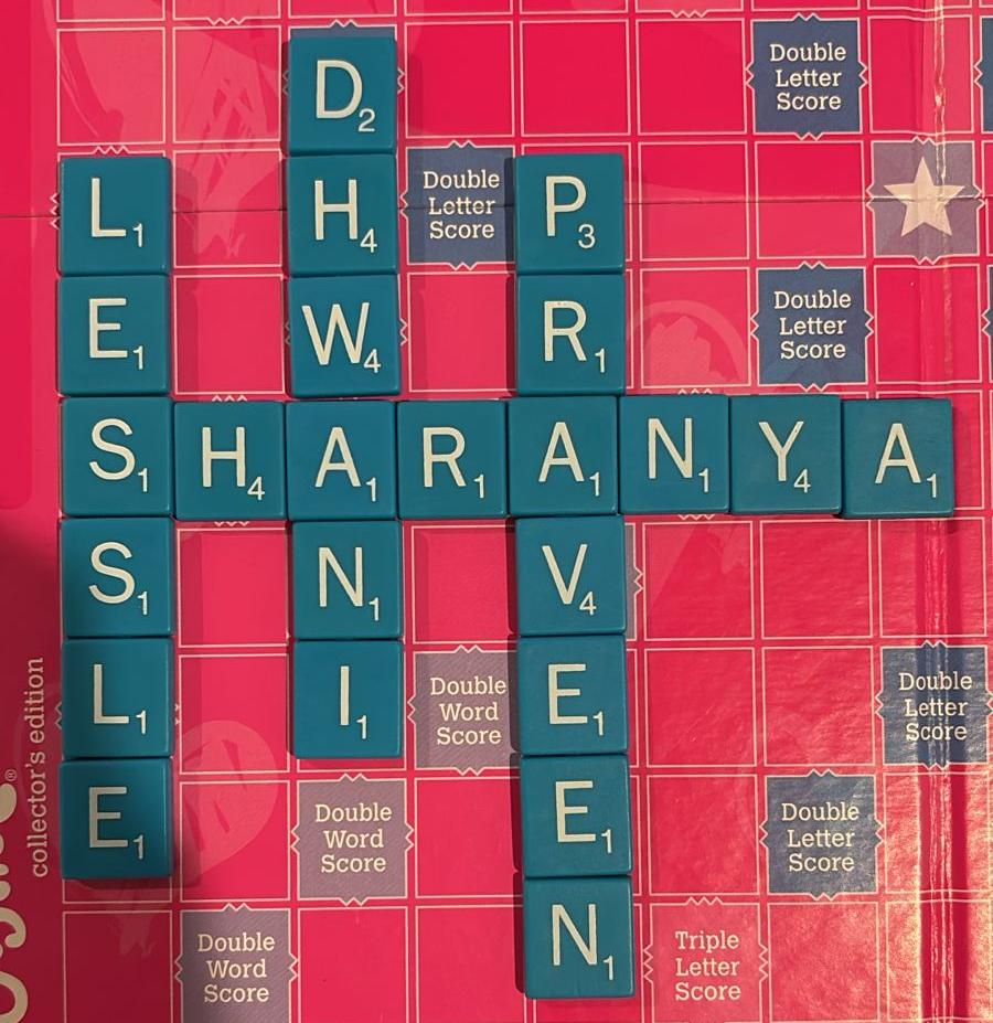
Presented alongside Ashley, Praveen, and Dhwani: built together since day one.
What we showed:
Walked through every chapter of the bridge, from the donor problem statement to the high-fidelity prototype.
Backed by a System Usability Scale score of 87.5
The poster was our visual anchor for the day - months of work distilled into one frame.
Built alongside teammates I'm grateful to have learned from. The bridge is theirs as much as it is mine.
Some projects end. Some teach you what to carry forward.
This one did both!
The day:
Two semesters of Research, Ideation, Design, and Testing, culminating in one presentation.
The end of our Master's program, and the end of a project we'd been building since spring.
The team:
Presented alongside Ashley, Praveen, and Dhwani: built together since day one.
What we showed:
Walked through every chapter of the bridge, from the donor problem statement to the high-fidelity prototype.
Backed by a System Usability Scale score of 87.5
The poster was our visual anchor for the day - months of work distilled into one frame.
Built alongside teammates I'm grateful to have learned from. The bridge is theirs as much as it is mine.
Some projects end. Some teach you what to carry forward.
This one did both!

Reflection
Looking back…
Looking back…
Looking back…
This project gave me a problem worth caring about, a team worth learning from, and three lessons I'll carry into every project after this one.
This project gave me a problem worth caring about, a team worth learning from, and three lessons I'll carry into every project after this one.
Three lessons
Three lessons
Three lessons
Three lessons emerged across the year about voice, constraints, and the kind of work I do best.
Three lessons emerged across the year about voice, constraints, and the kind of work I do best.
LESSON 1
LESSON 1
LESSON 1
I learned to champion my ideas
I learned to champion my ideas
I learned that good ideas don't carry themselves, they need someone to articulate and advocate for them.
Every time I used my voice, the work became stronger!
I learned that good ideas don't carry themselves, they need someone to articulate and advocate for them.
Every time I used my voice, the work became stronger!
LESSON 2
LESSON 2
LESSON 2
Constraints aren't setbacks; they're the work
Constraints aren't setbacks; they're the work
Trade-offs, changing requirements, and feedback didn't weaken the design; they sharpened it.
I learned that constraints are what shape the work!
Trade-offs, changing requirements, and feedback didn't weaken the design; they sharpened it.
I learned that constraints are what shape the work!
LESSON 3
LESSON 3
LESSON 3
I do my best work on the bridges
I do my best work on the bridges
I discovered that connecting research and design is where I thrive.
Translating user insights into experiences is the kind of work I enjoy most!
I discovered that connecting research and design is where I thrive.
Translating user insights into experiences is the kind of work I enjoy most!
Moments by the Bridge!
Moments by the Bridge!
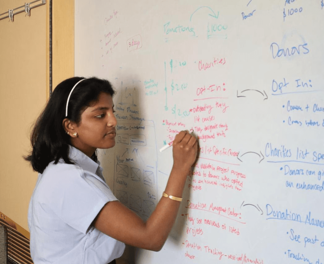
A year of work, whiteboard sessions, laughs, FigJam boards, and one capstone showcase.
A year of work, whiteboard sessions, laughs, FigJam boards, and one capstone showcase.