
Power Rangers
Power Rangers
Power Rangers
Power Is Back. Stronger. Darker. In Motion.
A motion graphics reimagining of an iconic superhero universe.
Power Is Back.
Stronger. Darker. In Motion.
A motion graphics reimagining of an iconic superhero universe.
Power Is Back. Stronger. Darker. In Motion.
A motion graphics reimagining of an iconic superhero universe.
Scroll down for the Power Teaser
Scroll down for the Power Teaser
Scroll down for the Power Teaser

Overview
Introduction
Introduction
Introduction
This project reimagines the Power Rangers franchise through a darker, cinematic motion graphics title sequence and launch visuals. It explores how a nostalgic brand can be reshaped with a more intense tone while preserving its iconic identity.
This project reimagines the Power Rangers franchise through a darker, cinematic motion graphics title sequence and launch visuals. It explores how a nostalgic brand can be reshaped with a more intense tone while preserving its iconic identity.
Tools Used
Tools Used
Tools Used





Project Timeline
Project Timeline
Project Timeline
3 Weeks
Oct 2024 - Dec 2024
3 Weeks
Oct 2024 - Dec 2024
My Role
My Role
My Role
Interaction Designer
Interaction Designer
Project Type
Project Type
Project Type
Academic
Academic
Team
Team
Team
Individual (Solo Project)
Individual (Solo Project)
Creative Suite
Creative Suite
Creative Suite
28 Assets
28 Assets
Requirements
Requirements
Requirements
The project includes a ~30-second animated movie title sequence, a movie poster and billboard, 6 digital ad assets, and 3 style frames establishing the visual tone of the Green Ranger’s dark transformation. Each deliverable was crafted to ensure visual consistency, narrative clarity, and professional-quality storytelling within the academic timeline.
The project includes a ~30-second animated movie title sequence, a movie poster and billboard, 6 digital ad assets, and 3 style frames establishing the visual tone of the Green Ranger’s dark transformation. Each deliverable was crafted to ensure visual consistency, narrative clarity, and professional-quality storytelling within the academic timeline.
Behind the Screen
Behind the Screen
From Idea to Execution
From Idea to Execution
From Idea to Execution
Inspiration
Shaping the Vision
Shaping the Vision
Shaping the Vision
I reimagined the iconic Power Rangers transformation moment with a darker, more cinematic tone. I was particularly inspired by the visual energy and atmosphere of Shang-Chi and the Legend of the Ten Rings, especially its use of symbolic power, dramatic lighting, and dynamic motion.
These influences shaped the visual direction of the project and guided the overall transformation sequence.
I reimagined the iconic Power Rangers transformation moment with a darker, more cinematic tone. I was particularly inspired by the visual energy and atmosphere of Shang-Chi and the Legend of the Ten Rings, especially its use of symbolic power, dramatic lighting, and dynamic motion.
These influences shaped the visual direction of the project and guided the overall transformation sequence.

Vision
Mood board : Designing the Arc
Mood board : Designing the Arc
Mood board : Designing the Arc
I first explored the narrative through hand sketches and moodboards to map the emotional flow of the sequence. As I began building the scenes in Maya, I refined the structure to balance the original vision with technical feasibility.
The sequence follows a cinematic progression - from dormant power, to activation, to the final confrontation, using light, motion, and atmosphere to build tension.
I first explored the narrative through hand sketches and moodboards to map the emotional flow of the sequence. As I began building the scenes in Maya, I refined the structure to balance the original vision with technical feasibility.
The sequence follows a cinematic progression - from dormant power, to activation, to the final confrontation, using light, motion, and atmosphere to build tension.

Early Exploration (Paper Concept)
Early Exploration (Paper Concept)
Early Exploration (Paper Concept)
The original sequence emphasized layered transformations and complex motion arcs, mapping the emotional progression before technical execution began.
The original sequence emphasized layered transformations and complex motion arcs, mapping the emotional progression before technical execution began.
The original sequence emphasized layered transformations and complex motion arcs, mapping the emotional progression before technical execution began.
Storyline
Storyline
Phase 1 : Awakening
Opening Title
"The Power Returns"
The Inactive Badge
A dark screen fades into a vast desert landscape. The wind moves slowly across the sand. A metallic Power Ranger badge lies half-buried, silent and inactive.
A dark screen fades into a vast desert landscape. The wind moves slowly across the sand. A metallic Power Ranger badge lies half-buried, silent and inactive.
Title appears
“Darker. Strongers. Unleashed.”


Phase 2 : Rising Tension
Phase 2 : Rising Tension
Badge Awakens
The buried badge begins to roll across the desert as a surge of green energy ignites within it. The long-dormant power has returned, signaling that the Rangers’ legacy is not over.
The buried badge begins to roll across the desert as a surge of green energy ignites within it. The long-dormant power has returned, signaling that the Rangers’ legacy is not over.
Ranger Introductions
Quick flashes introduce the Rangers — silhouettes, fragments of armor, sparks of their signature colors. Their presence builds momentum but remains mysterious.
Quick flashes introduce the Rangers, silhouettes, fragments of armor, sparks of their signature colors. Their presence builds momentum but remains mysterious.
Title appears
“A Dark Force Rises.”
Villain & Threads of Manipulation
The villain’s power spreads like invisible threads. The green energy begins to distort. The Green Ranger becomes corrupted, his badge flickering between control and resistance.
The villain’s power spreads like invisible threads. The green energy begins to distort. The Green Ranger becomes corrupted, his badge flickering between control and resistance.
Phase 3 : Confrontation
Phase 3 : Confrontation
Ranger Power Assembly
Badges of every Ranger color begin to appear across the screen — red, blue, yellow, black, pink — each activating with bursts of energy.
Badges of every Ranger color begin to appear across the screen: red, blue, yellow, black, pink - each activating with bursts of energy.
The Divide
The Rangers stand united against the rising threat, but the Green Ranger remains conflicted, caught between loyalty to the team and the villain’s manipulation.
The Rangers stand united against the rising threat, but the Green Ranger remains conflicted, caught between loyalty to the team and the villain’s manipulation.
Final Face-Off & Logo Reveal
Just as the battle reaches its peak, the screen fractures into light, forming the Power Rangers logo—leaving the fate of the Green Ranger uncertain.
Just as the battle reaches its peak, the screen fractures into light, forming the Power Rangers logo, leaving the fate of the Green Ranger uncertain.
Refined Direction
(Production-Aligned Vision)
Refined Direction
(Production-Aligned Vision)
Refined Direction
(Production-Aligned Vision)
As I began building in Maya, the flow was adjusted to maintain narrative clarity while working within realistic rendering and animation constraints.
As I began building in Maya, the flow was adjusted to maintain narrative clarity while working within realistic rendering and animation constraints.
As I began building in Maya, the flow was adjusted to maintain narrative clarity while working within realistic rendering and animation constraints.

Design Elements
Building the Visual System
Building the Visual System
Building the Visual System
To bring the transformation sequence to life, I developed visual components guiding the story from dormant power to the Emerald Rise identity. Although the brief focused on motion, I designed the Power Badge to strengthen the narrative. Learning new workflows in Maya under a tight timeline, I rendered it as the central visual anchor of the sequence.
The core components explored in this project include:
To bring the transformation sequence to life, I developed visual components guiding the story from dormant power to the Emerald Rise identity. Although the brief focused on motion, I designed the Power Badge to strengthen the narrative. Learning new workflows in Maya under a tight timeline, I rendered it as the central visual anchor of the sequence.
The core components explored in this project include:
Power Badge
Logo Design
Style Frames & Key Moments
Style Frames & Key Moments
Motion Explorations
Motion Explorations
1
1
1
Power Badge
Power Badge
Power Badge
I designed the Power Badge as the visual anchor, symbolizing the awakening of dormant power. After exploring sketches and brainstorming, I finalized the design I wanted to bring to life.
Working in Maya pushed me beyond my comfort zone, I refined the form, glow, and motion, and under a tight timeline, rendered 167 frames in 2 days, making the badge a central, narrative-driving element.
I designed the Power Badge as the visual anchor, symbolizing the awakening of dormant power. After exploring sketches and brainstorming, I finalized the design I wanted to bring to life.
Working in Maya pushed me beyond my comfort zone, I refined the form, glow, and motion, and under a tight timeline, rendered 167 frames in 2 days, making the badge a central, narrative-driving element.
I designed the Power Badge as the visual anchor, symbolizing the awakening of dormant power. After exploring sketches and brainstorming, I finalized the design I wanted to bring to life.
Working in Maya pushed me beyond my comfort zone, I refined the form, glow, and motion, and under a tight timeline, rendered 167 frames in 2 days, making the badge a central, narrative-driving element.
Different Views
Different Views
Different Views

The Making
The Making
The Making


Low-Fi to High-Fi
Low-Fi to High-Fi
Low-Fi to High-Fi


While the original brief focused primarily on the motion sequence, I introduced the Power Badge as an additional design element to strengthen the visual storytelling and emphasize the theme of awakening power.
The Power Badge acts as the central visual symbol of the sequence. It begins in a dormant state and gradually activates, representing the awakening of power. The design focuses on clarity and symbolism, allowing the badge to visually carry the transformation narrative while anchoring the sequence’s visual identity.
While the original brief focused primarily on the motion sequence, I introduced the Power Badge as an additional design element to strengthen the visual storytelling and emphasize the theme of awakening power.
The Power Badge acts as the central visual symbol of the sequence. It begins in a dormant state and gradually activates, representing the awakening of power. The design focuses on clarity and symbolism, allowing the badge to visually carry the transformation narrative while anchoring the sequence’s visual identity.

Final Power Logo Design
Final Power Logo Design
2
2
2
Power Logo
Power Logo
Power Logo
I began the Emerald Rise logo by sketching several ideas on paper to explore different forms and visual directions. After identifying a strong concept, I translated the design into a digital version and refined the final identity in Adobe Photoshop.
The symbol represents strength and emergence, serving as the final visual identity revealed at the end of the transformation sequence.
I began the Emerald Rise logo by sketching several ideas on paper to explore different forms and visual directions. After identifying a strong concept, I translated the design into a digital version and refined the final identity in Adobe Photoshop.
The symbol represents strength and emergence, serving as the final visual identity revealed at the end of the transformation sequence.
I began the Emerald Rise logo by sketching several ideas on paper to explore different forms and visual directions. After identifying a strong concept, I translated the design into a digital version and refined the final identity in Adobe Photoshop.
The symbol represents strength and emergence, serving as the final visual identity revealed at the end of the transformation sequence.
The Making
The Making
The Making


3
3
3
Style Frames & Key Moments
Style Frames & Key Moments
Style Frames & Key Moments
I captured selected frames from the final sequence to highlight the visual tone and progression of the story. Each frame represents a shift in power, tension, and conflict, guiding the narrative from awakening to confrontation.
The sequence moves through key moments, power awakening, manipulation of the Green Ranger, the rise of darkness, and the final face-off, culminating in a unified clash that leads into the final reveal.
I captured selected frames from the final sequence to highlight the visual tone and progression of the story. Each frame represents a shift in power, tension, and conflict, guiding the narrative from awakening to confrontation.
The sequence moves through key moments, power awakening, manipulation of the Green Ranger, the rise of darkness, and the final face-off, culminating in a unified clash that leads into the final reveal.
I captured selected frames from the final sequence to highlight the visual tone and progression of the story. Each frame represents a shift in power, tension, and conflict, guiding the narrative from awakening to confrontation.
The sequence moves through key moments, power awakening, manipulation of the Green Ranger, the rise of darkness, and the final face-off, culminating in a unified clash that leads into the final reveal.

4
4
4
Motion Explorations
Motion Explorations
Motion Explorations
I created a set of short GIFs to capture key moments of motion and energy from the sequence. These focused on the Green Ranger’s transformation and internal conflict, highlighting the shift between control and resistance.
An additional GIF brings together the Rangers through a split-face composition, reinforcing identity, contrast, and team dynamics within the narrative.
I created a set of short GIFs to capture key moments of motion and energy from the sequence. These focused on the Green Ranger’s transformation and internal conflict, highlighting the shift between control and resistance.
An additional GIF brings together the Rangers through a split-face composition, reinforcing identity, contrast, and team dynamics within the narrative.
I created a set of short GIFs to capture key moments of motion and energy from the sequence. These focused on the Green Ranger’s transformation and internal conflict, highlighting the shift between control and resistance.
An additional GIF brings together the Rangers through a split-face composition, reinforcing identity, contrast, and team dynamics within the narrative.
Design Language System
Refining the Visual Identity
Refining the Visual Identity
Refining the Visual Identity
To maintain consistency across the sequence and supporting visuals, I developed a cohesive design language that defines the project’s tone, energy, and visual identity.
To reinforce the cinematic atmosphere while supporting the themes of power, transformation, and contrast, this system focuses on:
To maintain consistency across the sequence and supporting visuals, I developed a cohesive design language that defines the project’s tone, energy, and visual identity.
To reinforce the cinematic atmosphere while supporting the themes of power, transformation, and contrast, this system focuses on:
Typography
Colors
Textures
1
1
1
Typography
Typography
Typography
I used Azonix for titles, logo headings, and key highlights to convey strength and a bold, futuristic tone. Its sharp, geometric form reinforces the cinematic and high-energy feel of the sequence.
For supporting text, I used Century Gothic to maintain clarity and readability, especially for Ranger introductions and character names. This combination creates a balance between impact and legibility across the visuals.
I used Azonix for titles, logo headings, and key highlights to convey strength and a bold, futuristic tone. Its sharp, geometric form reinforces the cinematic and high-energy feel of the sequence.
For supporting text, I used Century Gothic to maintain clarity and readability, especially for Ranger introductions and character names. This combination creates a balance between impact and legibility across the visuals.
Azonix
Azonix
Regular
Regular
Name
Name
Titles
Sub heading
Logo Heading
Font size
Font size
180 px
36 px
180 px
A
A
Heading
A
A
Heading
Century Gothic
Century Gothic
Regular
Regular
|
Bold
Bold
Name
Name
Ranger Name
Character Name
Font size
Font size
60 px
36 px
2
2
2
Colors & Textures
Colors & Textures
Colors & Textures
I used color as a primary storytelling tool to represent identity and emotion within the sequence. Each Ranger is associated with a distinct color, while darker tones and contrasting accents help build tension and highlight the shift toward conflict.
Textures were introduced to enhance depth and atmosphere, from fluid energy patterns to darker, chaotic surfaces representing manipulation and control. Together, color and texture reinforce the cinematic tone and the progression from power awakening to confrontation.
I used color as a primary storytelling tool to represent identity and emotion within the sequence. Each Ranger is associated with a distinct color, while darker tones and contrasting accents help build tension and highlight the shift toward conflict.
Textures were introduced to enhance depth and atmosphere, from fluid energy patterns to darker, chaotic surfaces representing manipulation and control. Together, color and texture reinforce the cinematic tone and the progression from power awakening to confrontation.
Primary/ #00E8CD
Secondary/ #640A13
Secondary/ #640A13
Blue Ranger/ #034EB4
Pink Ranger/ #E643E7
Red Ranger/ #FF455C
Yellow Ranger/ #FAF508
Green Ranger/ #0EF52E
Black Ranger/ #181818
Primary/ #00E8CD
Secondary/ #640A13
Secondary/ #640A13

Threads of Manipulation

Titles

Green Ranger Shades
Billboards & Mockups
Final Visual Outputs
Final Visual Outputs
Final Visual Outputs
I extended the visual system into posters and billboard designs, focusing on strong compositions that capture the film’s tone and intensity.
Each piece highlights key characters and conflict while maintaining consistency in color, typography, and overall visual language.
I extended the visual system into posters and billboard designs, focusing on strong compositions that capture the film’s tone and intensity.
Each piece highlights key characters and conflict while maintaining consistency in color, typography, and overall visual language.

Campaign Mockups

Web Ad Banners
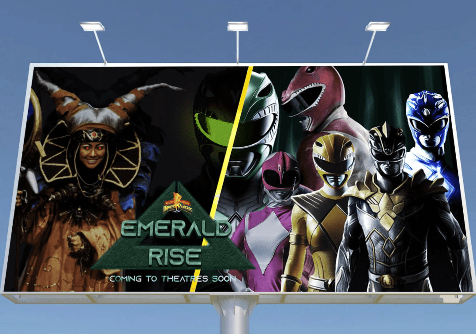
Billboard
Some BTS Shots
Some BTS Shots
View Next Project
View Next Project


Index
Power Teaser
Overview
Inspiration
Vision
Design Elements
Design Language System
Billboard & Mockups
Index
Power Teaser
Overview
Inspiration
Vision
Design Elements
Design Language System
Billboard & Mockups
Index
Power Teaser
Overview
Inspiration
Vision
Design Elements
Design Language System
Billboard & Mockups